Wag World
- Jump to:
- Case Study
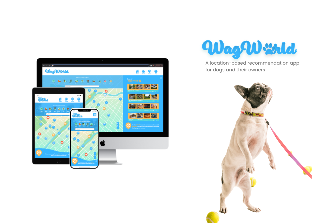
The project objective was to design a responsive web app for location-based recommendations that meets the requirements of its users and solves the problems they face with existing location-based recommendation apps. The niche audience I chose to focus on was dog owners; being a dog owner myself, I knew there was a need in the marketplace of existing location-based apps that weren’t really meeting my needs when it came to finding dog-friendly locales in my area. The solution was an app that has an extensive database solely consisting of dog-friendly locales and dog-centered businesses/spaces, with additional filters meant to help users with specific concerns.
My Process
Research
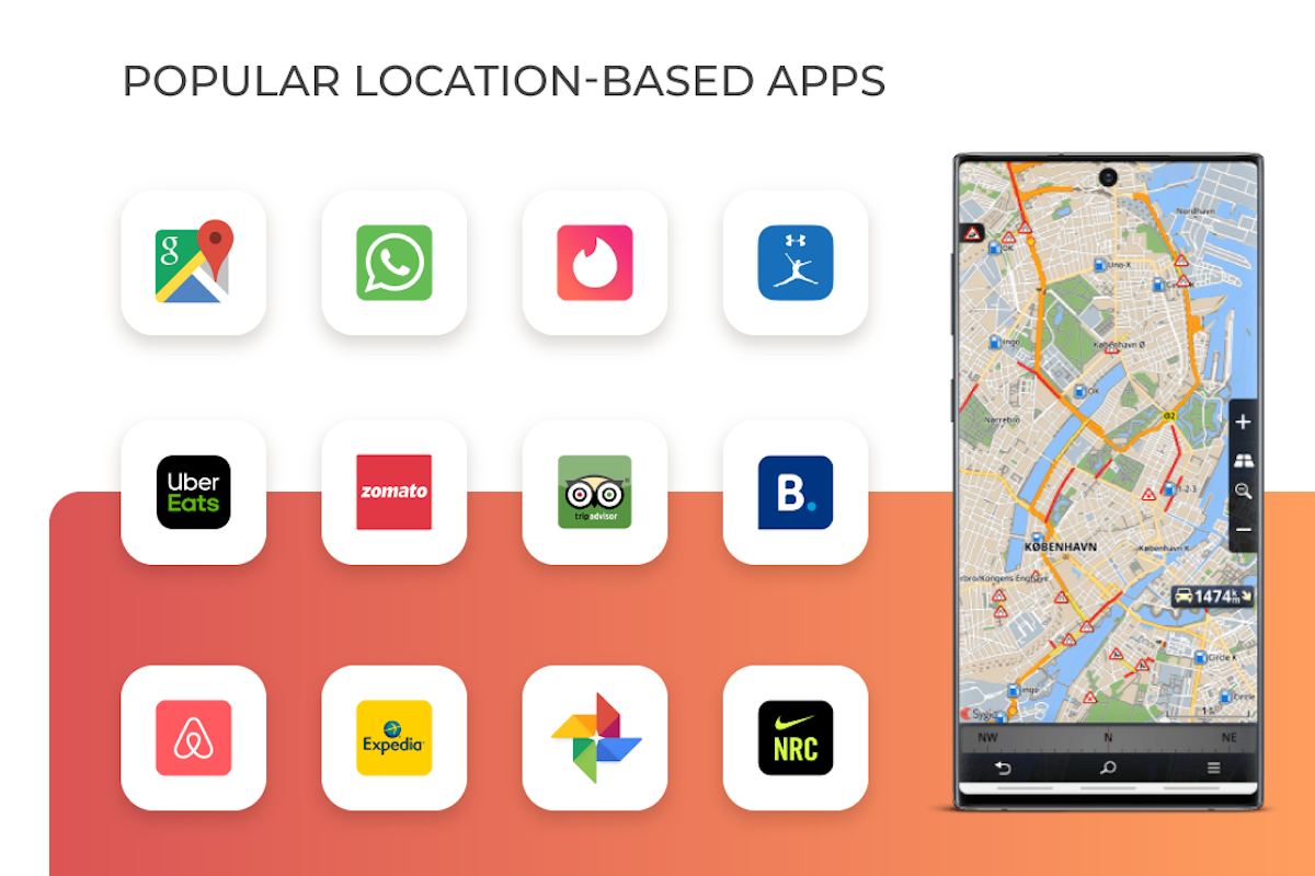
During the research phase of the project, I conducted a competitive analysis and user interviews. For my competitive analysis, I analyzed industry leaders Google Maps and AirBnb and identified some weaknesses that presented opportunities for a new app, such as inaccurate, unclear or incomplete location details that would necessitate further research by users on Google Maps and pricing out of key groups of users on AirBnb. I conducted several interviews with potential users that fit my target demo and asked them exploratory questions such as how they normally use location-based recommendation apps, if they’ve ever tried using them to search for dog-friendly locations, what their concerns were for their own dogs outside of the home, and what sort of features they would like to see on a location-based app specific to dog owners.
Ideation
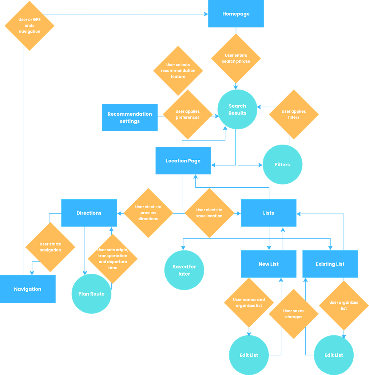
From my research, I came up with my 3 key user personas each with their own needs: The Adventurous Dog Owner, The Metropolite Dog Owner, and the Suburban/Family Dog Owner. I identified key goals that the app would need to meet for all 3 and defined the MVP for the app: an extensive database solely consisting of all dog-friendly locales in the area, as well as advanced filters for different types of locale to meet the special needs of owners and their dog (E.g. foot traffic filter on hikes, special needs filters on services, dog friendly amenities on hotels, etc.). Based on the tasks to be done to meet these goals and the screens I knew the app would need, I mapped out a user flow diagram.
Wireframe
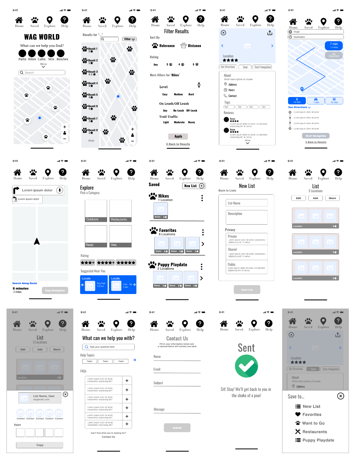
Referencing the user flow diagram, I then employed the Crazy 8 design sprint method to come up with 2 rough sketches of all the main screens I wanted to include in the app, and from those options, chose the following for my first prototype. I created my first prototype using these low-fidelity wireframes and sent it my key users to test the navigation of the app in a simple task analysis, and recorded feedback to be incorporated into the mid-fidelity wireframes.
Design
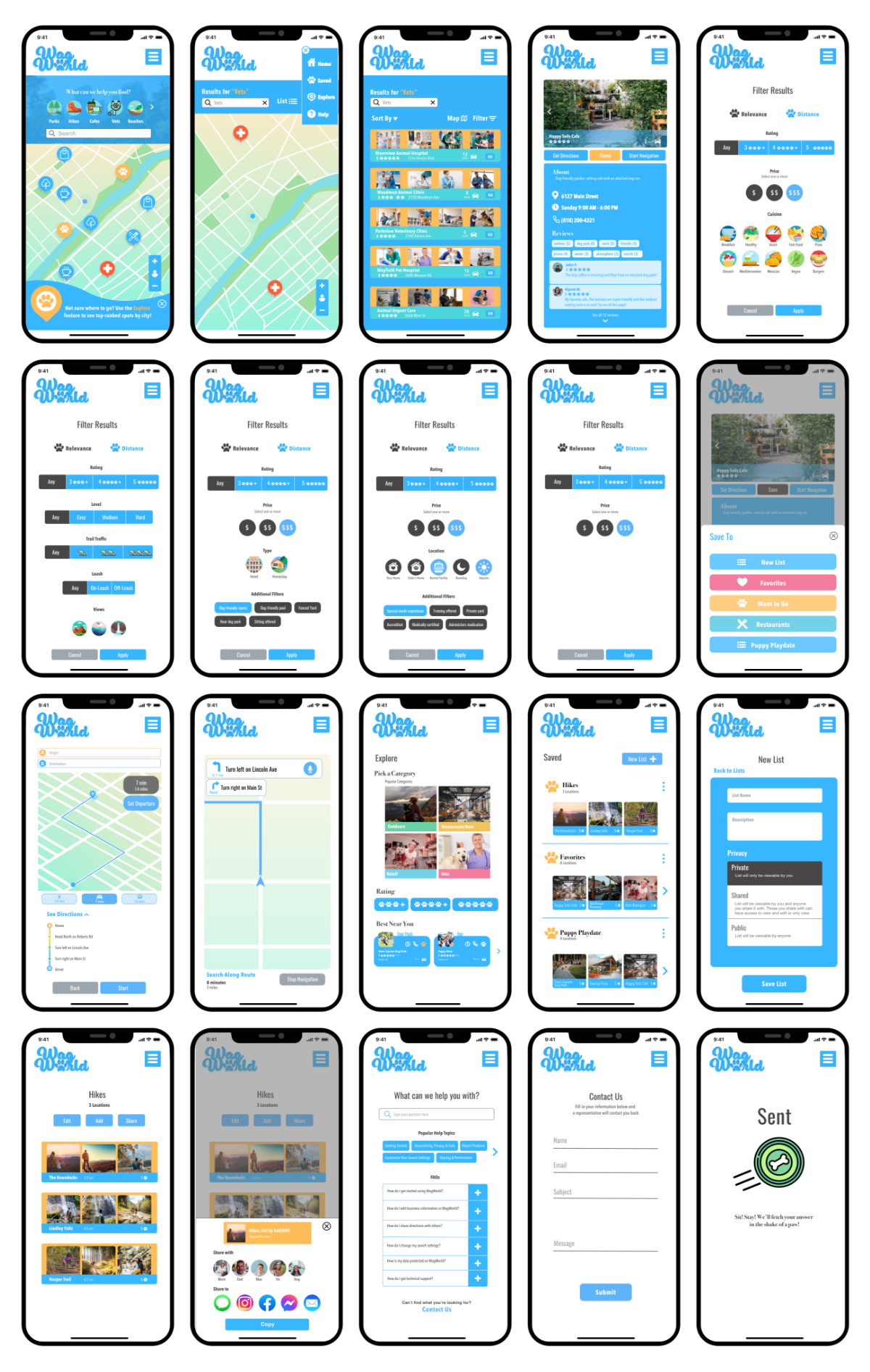
For the visual design of the app, I started out with a moodboard, gathering imagery, colors, design elements and icons that I knew would be reflective of the brand and incorporated into the final wireframes. I sent these wireframes over for a peer review to gather feedback and then made a few tweaks to come up with my final screen designs.
Conclusion
I received some very positive feedback from testers and professional designers verifying the utility of such an app in the marketplace. I learned a lot about the full design process, from ideation to UX and final wireframes, and experienced first-hand how important early user testing is.Plans for further development of this app would include additional features, such as a user forum for fellow dog owners to connect and share recommendations, as well as city-specific travel guides compiled by local experts.